The Web Form has a responsive layout that adjusts to different screen sizes. For example, when the user opens the Web Form on a phone, a single-column layout is used with adjusted typography. When the Web Form is opened on a computer screen with a high resolution, a different layout is chosen that utilizes a multi-column design, wider margins, and more pronounced typography.
This responsiveness is achieved through the browser's support for media queries. Media queries allow different CSS styles to be applied based on the available space. The available space is measured by the overall width and height of the page, but the Web Form only considers the width.
There are defined “breakpoints” in the Web Form 2.0:
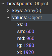
The breakpoints define different layouts:
-
‘xs’ – extra small
-
‘sm’ – small
-
‘md’ – medium
-
‘lg’ – large
-
‘xl’ – extra large
The number value represents the page width in pixels at which the corresponding layout becomes active. For example, when the page width is 1000px, the medium layout is activated (it's already over 960px for medium, but not yet 1280px for large).
This works fine when the Web Form’s width matches the page’s width. However, the Web Form is a web component widget, which you may embed in a container with a width smaller than the full page width.
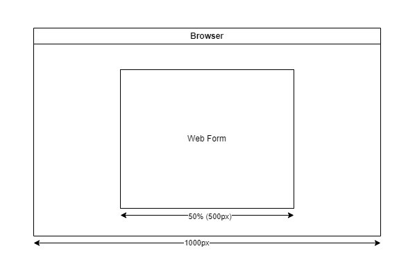
In this case, based on the original breakpoint values, the Web Form would still choose the medium layout, since it measures the entire page width as 1000px. However, the actual container is only 500px wide, so the correct layout should be extra-small.
We need to adjust the breakpoints:
{
  xs: 0,
  sm: 1200, // 600*2
  md: 1920, // 960*2
  lg: 2560, // 1280*2
  xl: 3840, // 1920*2
}
Now, with the page width at 1000px and the container width at 500px, the Web Form will correctly select the extra-small layout. If the page is resized, for example, to 1920px, the Web Form will switch to the medium layout (since the container size is now 960px, which corresponds to the original medium breakpoint).
You can pass this new layout config as a property when loading the Web Form:
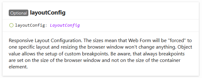
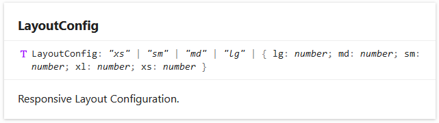
LayoutConfig type also accepts fixed values ‘xs’, ‘sm’, ‘md’, and ‘lg’.
'xl' is missing because currently, ‘lg’ is the largest layout defined in the Web Form. However, we’ve kept the breakpoint value in place in case we need to use it in the future.
The fixed values will force the Web Form to always render with the corresponding layout. This is useful when the container has a static size that doesn’t change as the page is resized.
With this configuration, the Web Form should render with the appropriate layout.
Finally, we should mention container queries. Container queries are a relatively new browser API that functions like media queries, but they are based on the container size instead of the page size. This is exactly what we’re aiming to achieve with the method described above, and they will significantly simplify Web Form usage. Container queries are already on our roadmap as part of our ongoing efforts to upgrade the Web Form framework.