

General
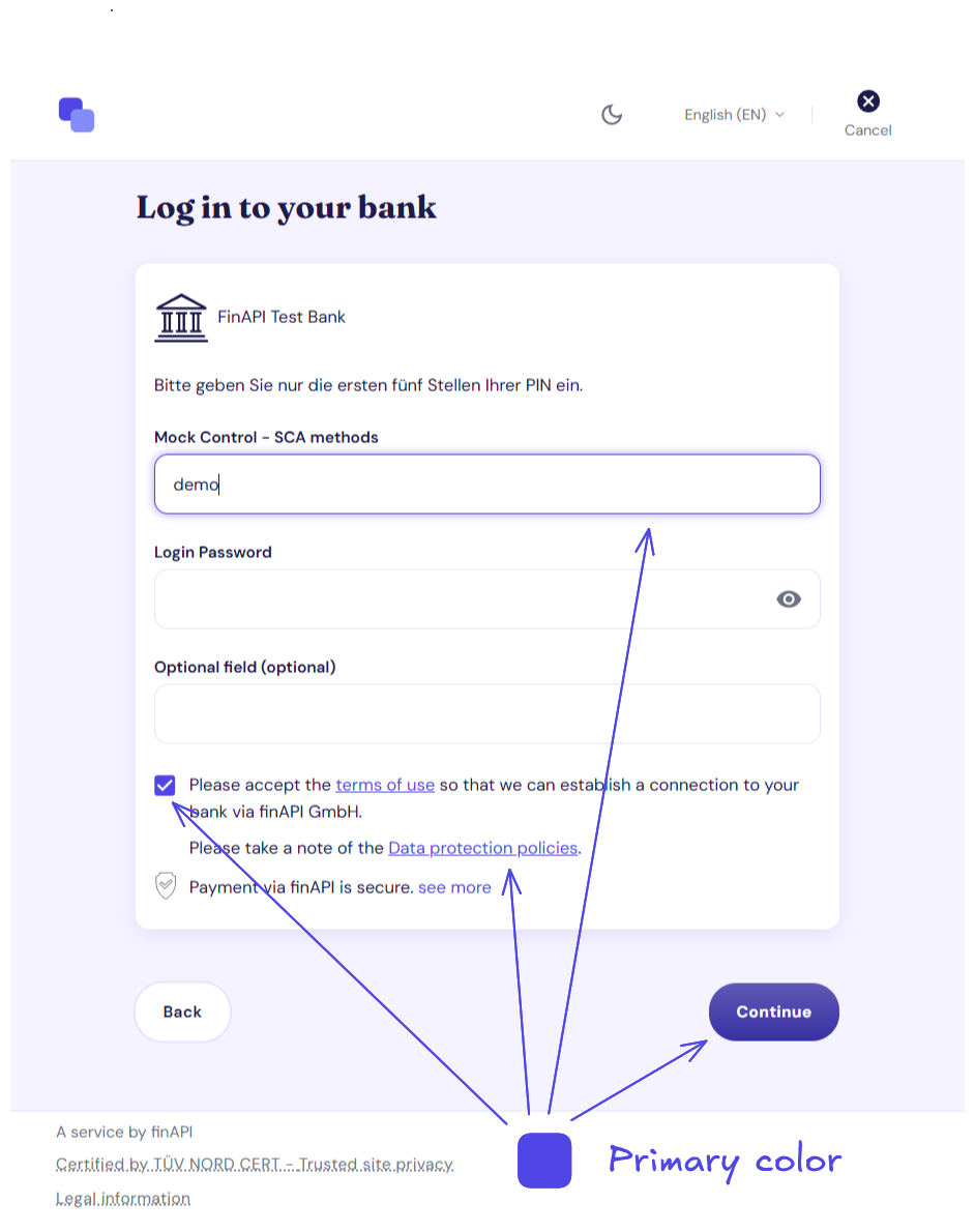
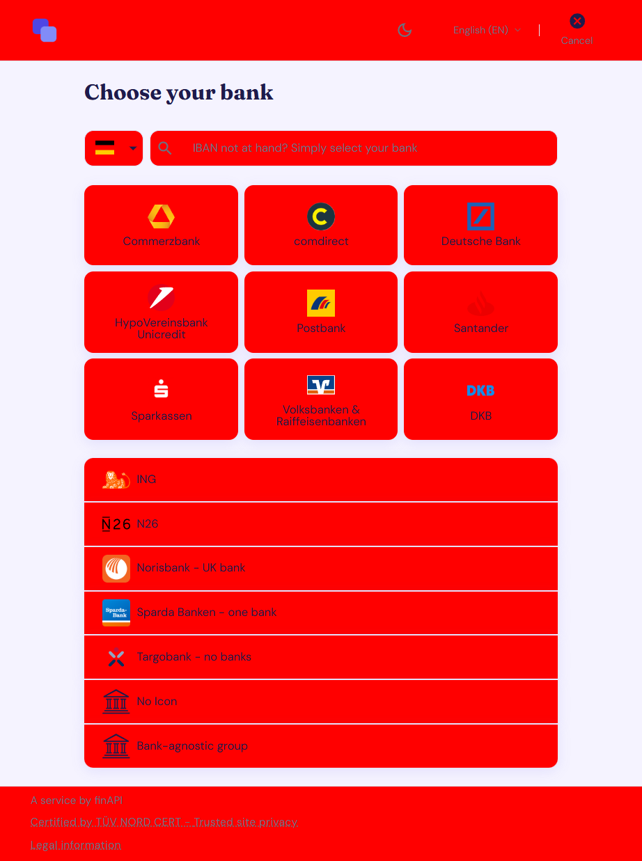
The Profile lets you define a set of color slots that are applied consistently to specific elements throughout the form. Set your brand colors once, and they’re automatically used wherever needed — no need to style individual components.
Color Slots
Primary
Your main brand color, used for buttons, active states, progress indicators, and other interactive highlights.
Set the primary color once, and finAPI automatically generates light and dark variants to ensure a consistent appearance across the form. If you need more control, you can override each variant individually.
Text
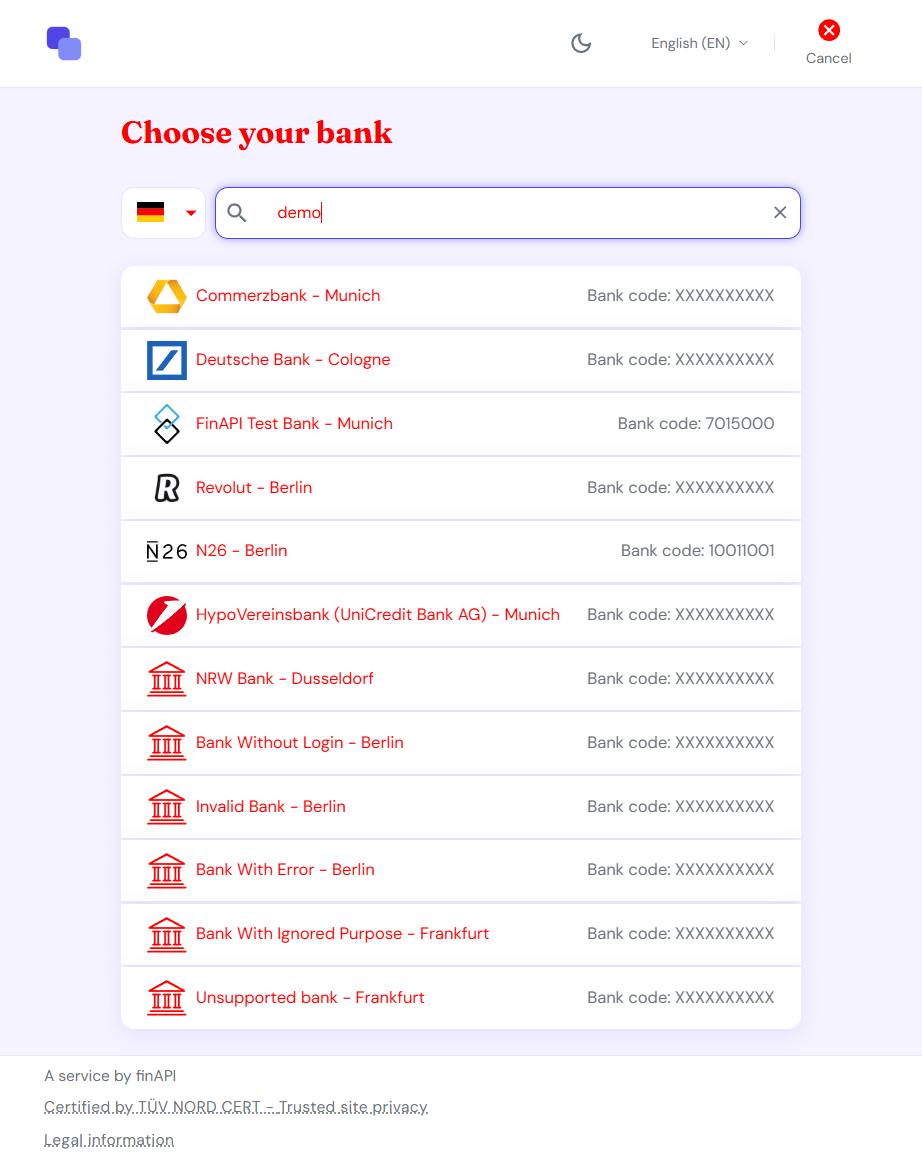
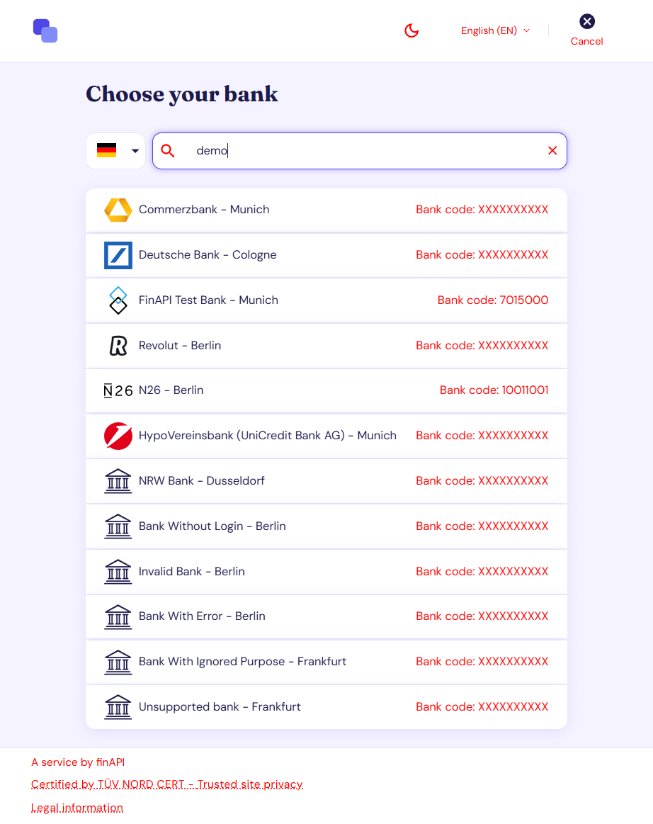
Two text color levels are available:
-
Primary — used for headings and main body text.
-
Secondary — used for hints, labels, and supporting information.
Note: Primary and secondary text can use the same color. This creates a more uniform appearance by removing the visual distinction between text levels and can be a good choice for minimalist designs.
Background
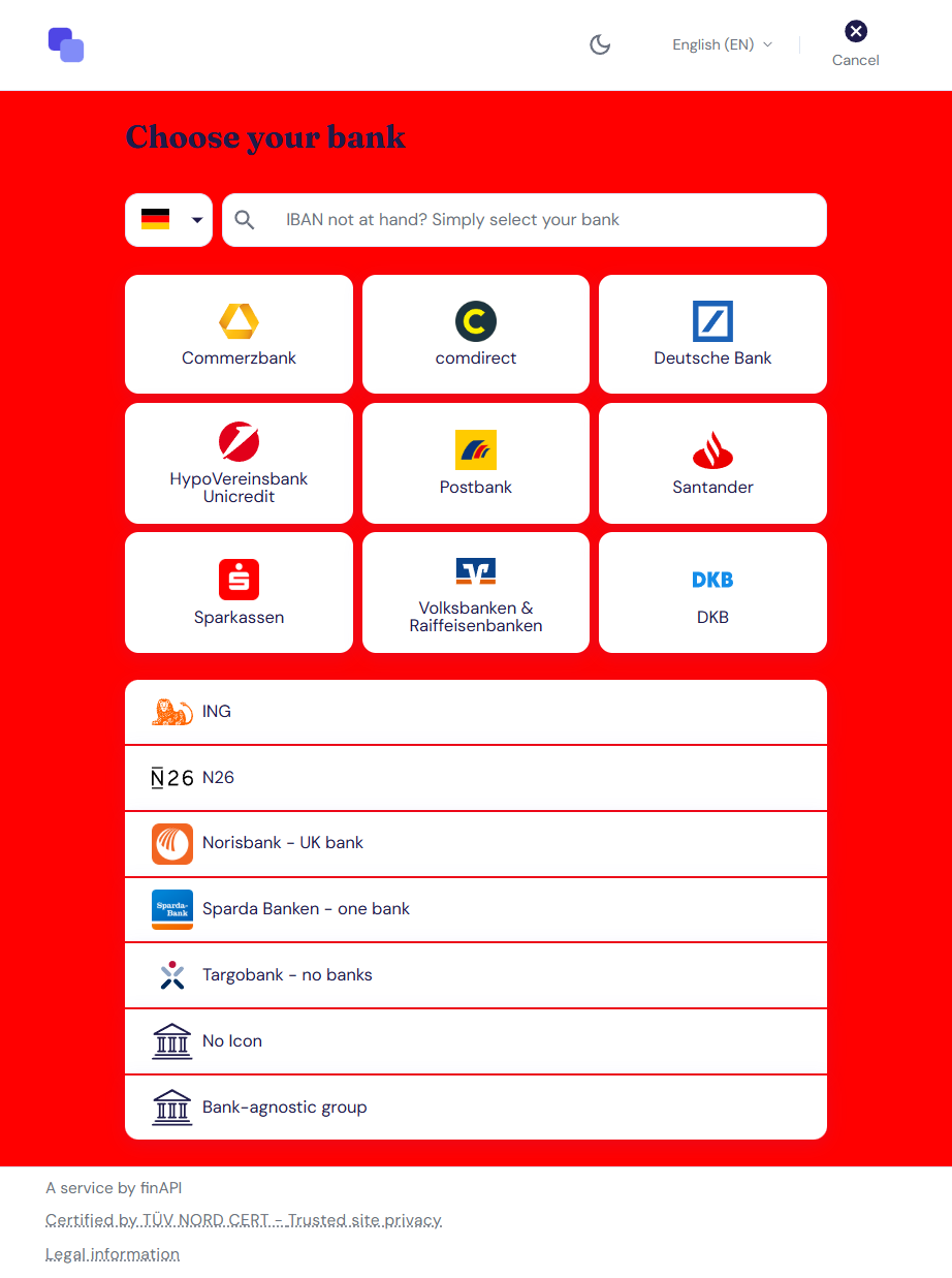
Two background color levels are available:
-
Default — used for the overall page background.
-
Paper — used for cards, dialogs, and other elevated surfaces.
Note: The Paper color can be set to match the Default background. When combined with disabled shadows, this creates a flat, seamless appearance without visible card boundaries and is particularly useful for embedded forms that should blend naturally into the surrounding page.
Divider
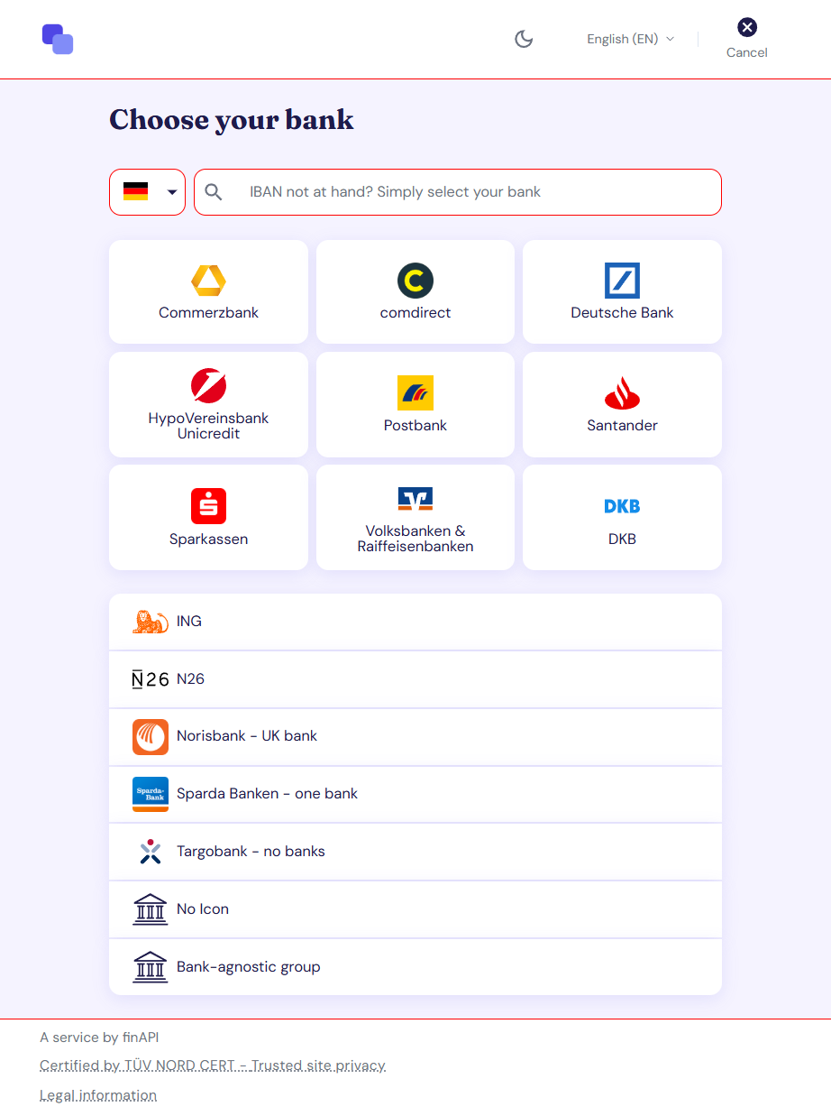
This is the color of separator lines between sections.
Technical Setup
Configure the light color palette under theme.palette.light in the profile. All fields are optional. If a field is not specified, the finAPI default value is used.
Note: The dark color palette follows the same structure under
theme.palette.dark. See Dark Mode for details.
Fields
All paths below are relative to theme.palette.light.
|
Field |
Description |
|---|---|
|
|
The main color of your brand. Applied to primary buttons, input field borders and highlighted elements. |
|
|
The lighter shade of the main color, applied to secondary elements such as secondary buttons — derived from |
|
|
The darker shade of the main color, applied for example to hovered primary elements — derived from |
|
|
The color of the main texts, for example the headers |
|
|
The color of the secondary texts, for example the login hints or the summaries |
|
|
The color of the texts of disabled elements |
|
|
The background color of the web form page |
|
|
The background color of elevated elements such as cards and dialogs |
|
|
The color of the lines separating the web form sections |
The
lightanddarkvariants of the primary color are automatically generated by lightening and darkening themaincolor. Override these values only if the automatically generated colors do not meet your brand requirements.
Color Format
All color values must use the hexadecimal RGB format: #RRGGBB.
Example
{
  "theme": {
    "palette": {
      "light": {
        "primary": {
          "main": "#1A73E8",
          "light": "#5A9FF0",
          "dark": "#0D47A1"
        },
        "text": {
          "primary": "#212121",
          "secondary": "#757575",
          "disabled": "#9E9E9E"
        },
        "background": {
          "default": "#FFFFFF",
          "paper": "#F5F5F5"
        },
        "divider": "#E0E0E0"
      }
    }
  }
}