

General
Beyond colors and typography, you can customize the appearance of individual interface elements, including buttons, input fields, links, shapes, shadows, and icons.
Buttons
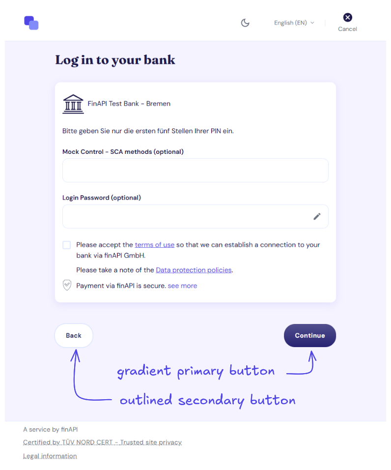
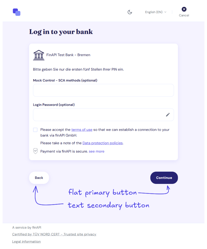
The form uses two button types: primary buttons for main actions and secondary buttons for supporting actions. Each can be styled independently.
-
Primary button — choose between a solid fill or a gradient.
-
Secondary button — choose between a text-only or outlined style.
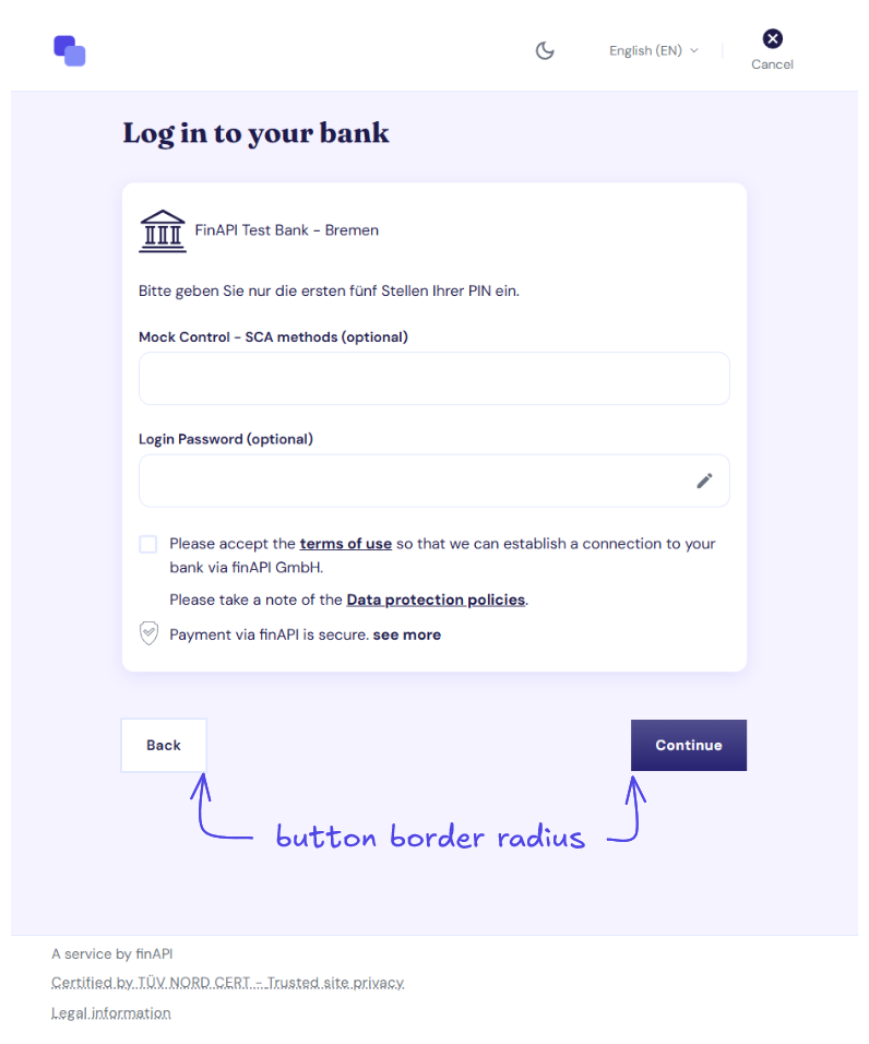
You can also configure the corner radius of buttons independently from the global shape setting.
Input Fields
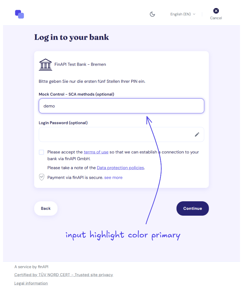
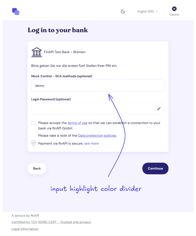
When an input field receives focus, its border is highlighted. You can use either the primary brand color or a neutral divider color for a more subtle appearance.
Links
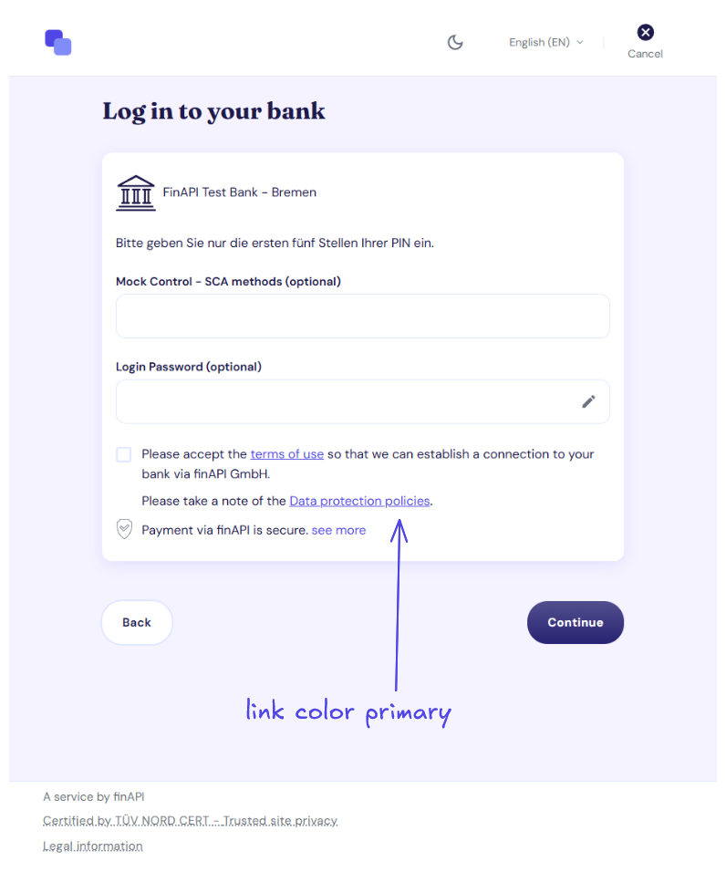
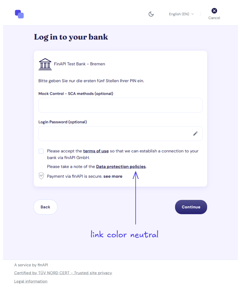
Links can use either the primary brand color or a neutral color that blends more closely with the surrounding text.
Shape
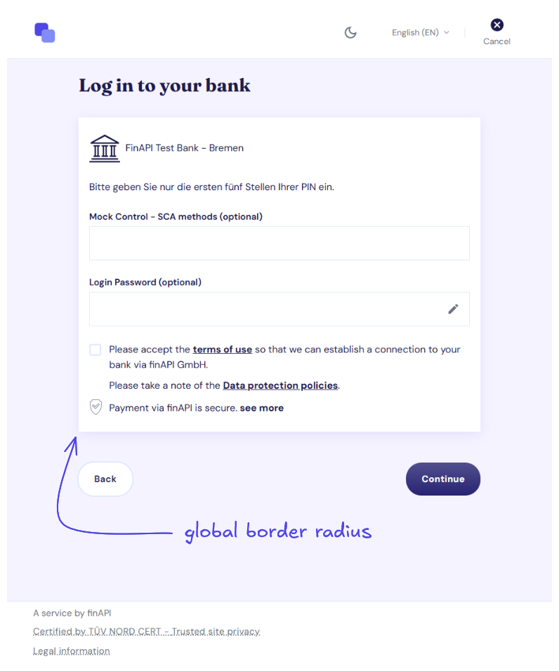
The global corner radius defines the default shape of elements such as cards, input fields, and buttons.
Individual components, such as buttons, can override the global radius with their own settings.
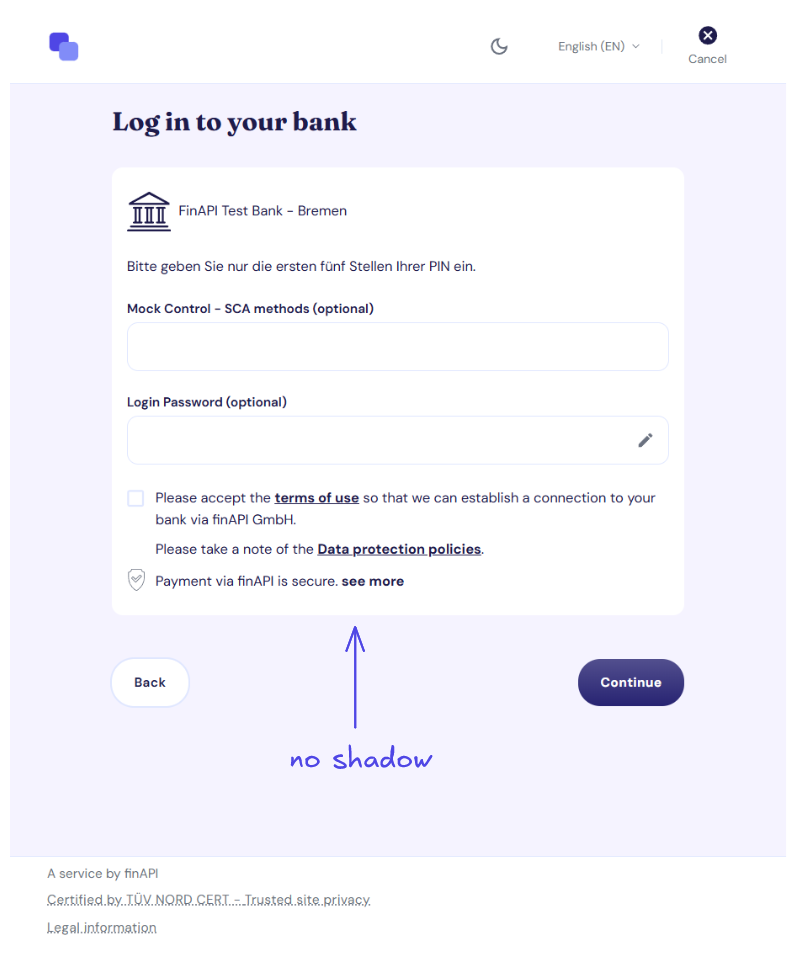
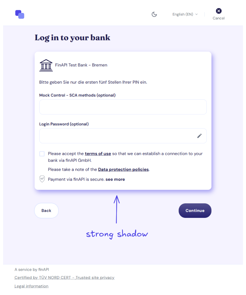
Shadows
You can define a CSS shadow that is applied consistently to elevated surfaces throughout the form. This allows you to customize properties such as offset, blur, spread, and shadow color.
Icons
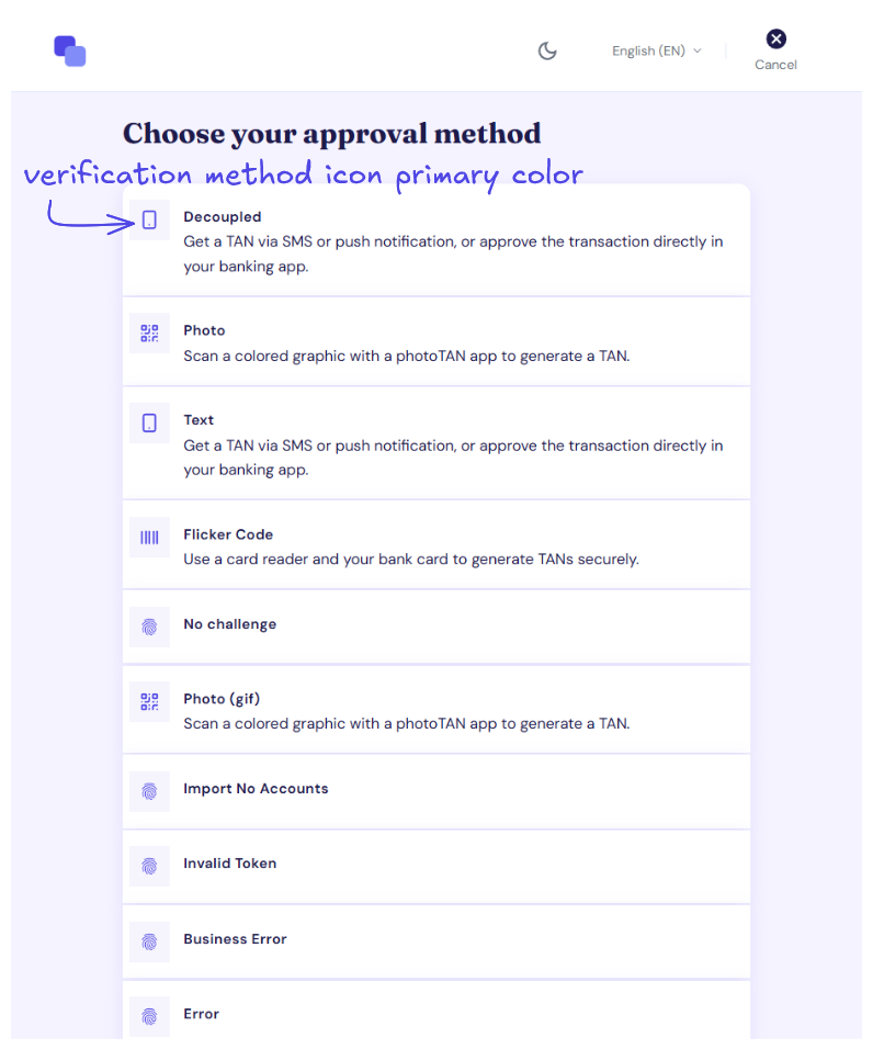
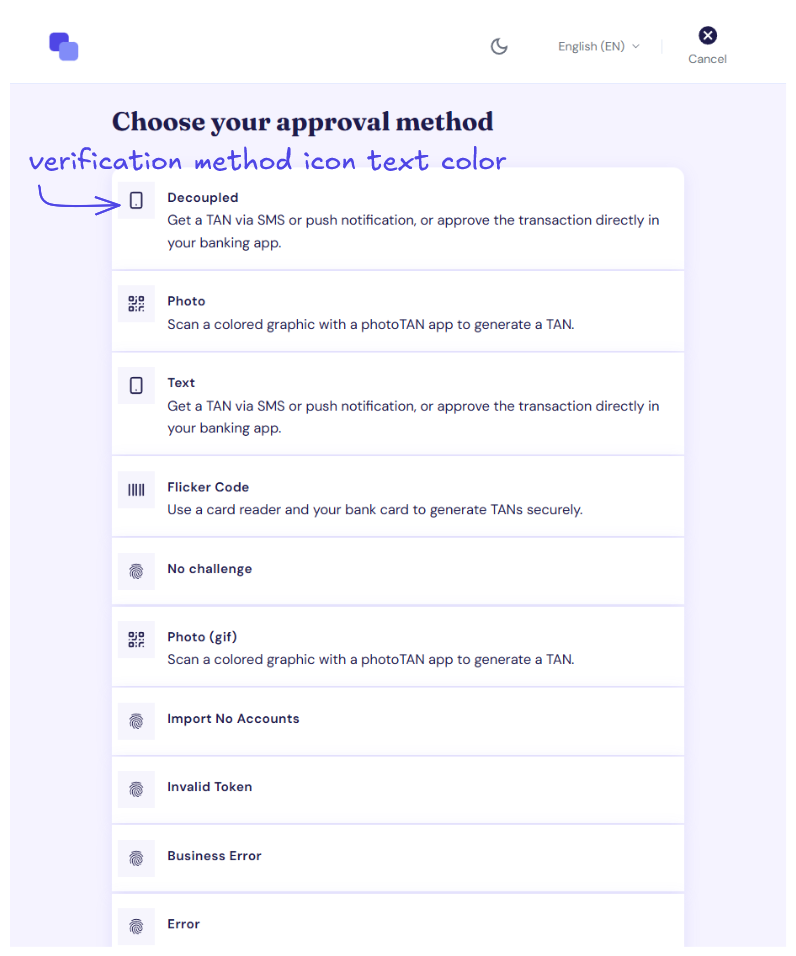
The icon displayed during verification method selection can use either the primary brand color or the default text color.
Technical Setup
Component styling is configured under theme in the profile. All fields are optional — for any field you omit, the finAPI default applies.
Fields
Paths are relative to theme.
|
Field |
Values |
Description |
|---|---|---|
|
|
|
How the primary buttons are filled. |
|
|
|
How the secondary buttons are rendered. |
|
|
integer, 0–65535 |
Corner radius for buttons in pixels, overriding the global shape setting |
|
|
|
Which color highlights an input field when it is focused or hovered — its border and glow. |
|
|
|
Which color the links are rendered in. |
|
|
|
Which color the verification method icons (photoTAN, pushTAN, …) are rendered in. |
|
|
integer, 0–65535 |
The corner radius of the web form elements, in pixels |
|
|
CSS |
The shadow applied to the elevated elements of the web form. Up to 512 characters. |
shadowsaccepts only letters, digits, spaces and the#,%,(,),,,.and-characters.
Example
{
  "theme": {
    "shape": {
      "borderRadius": 8
    },
    "shadows": "rgba(0, 0, 0, 0.12) 0px 2px 8px 0px",
    "components": {
      "button": {
        "primary": { "variant": "GRADIENT" },
        "secondary": { "variant": "OUTLINED" },
        "borderRadius": 24
      },
      "input": {
        "highlightColor": "PRIMARY"
      },
      "link": {
        "color": "PRIMARY"
      },
      "icon": {
        "verificationMethod": { "color": "PRIMARY" }
      }
    }
  }
}