

General
The form supports two color modes: light and dark. Each mode has its own independently configured palette and uses the same set of color options. This page describes the dark palette and the settings that control color mode behavior.
Dark Palette
The dark palette uses the same color options as the light palette, including primary, text, background, panel, and divider colors. Each can be configured independently for dark mode.
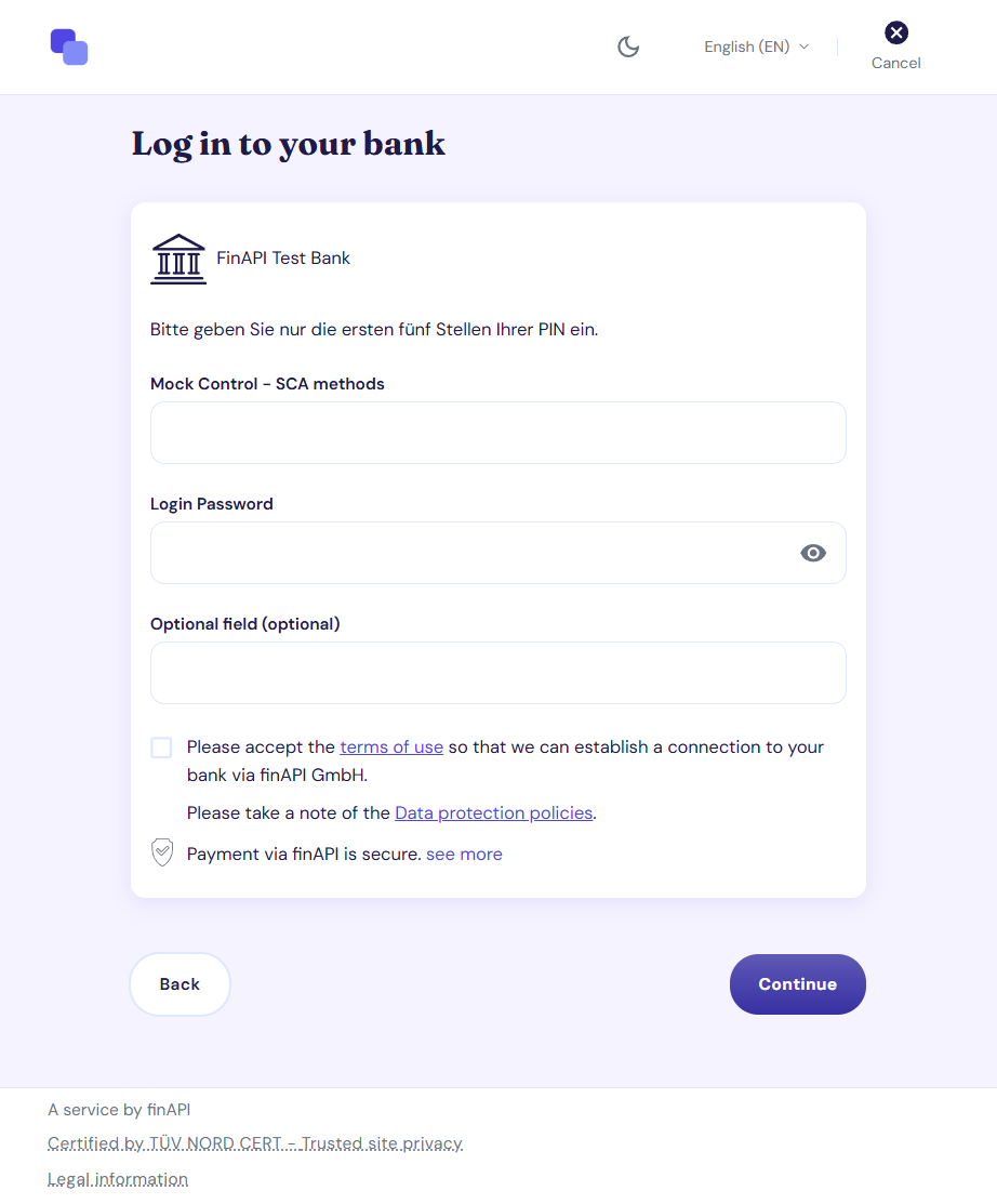
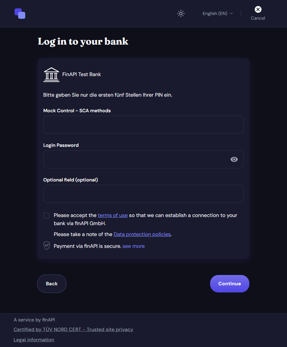
Default Mode
You can define whether the form initially opens in light or dark mode.
Note: If no default mode is specified, the form automatically uses the end user's system preference.
Mode Toggle
You can display a toggle that allows users to switch between light and dark mode directly within the form.
Note: If the toggle is hidden, the form remains in the configured default mode. If no default mode is specified, it uses the mode detected from the end user's system preference.
The color mode can also be controlled externally from your application. This allows you to synchronize the form with the appearance setting users have already selected in your product.
Technical Setup
Configure the dark palette under theme.palette.dark in the profile. Color mode behavior is configured under functionality.colorMode.
All fields are optional. If a field is not specified, the finAPI default value is used.
Important: The colorMode settings only take effect when theme.base is set to DEFAULT_V2_1. With 2.0 base themes, these settings are accepted but have no effect.The colorMode settings only take effect when the base theme is DEFAULT_V2_1 (theme.base). With the 2.0 base themes they are accepted but have no effect.
Dark Palette Fields
All paths below are relative to theme.palette.dark. The structure is identical to theme.palette.light.
|
Field |
Description |
|---|---|
|
|
The main brand color in dark mode |
|
|
The lighter shade of the main color — derived from |
|
|
The darker shade of the main color, used for hovered primary elements — derived from |
|
|
The color of the main texts in dark mode |
|
|
The color of the secondary texts in dark mode |
|
|
The color of the texts of disabled elements in dark mode |
|
|
The background color of the page in dark mode |
|
|
The background color of elevated elements such as cards and dialogs in dark mode |
|
|
The color of the separator lines in dark mode |
Mode Behavior Fields
|
Field |
Values |
Default |
Description |
|---|---|---|---|
|
|
|
system preference |
The mode the form opens in |
|
|
|
|
Whether the mode toggle button is visible |
Example
{
  "functionality": {
    "colorMode": {
      "initial": "DARK",
      "toggler": "RENDER"
    }
  },
  "theme": {
    "base": "DEFAULT_V2_1",
    "palette": {
      "dark": {
        "primary": {
          "main": "#5A9FF0"
        },
        "text": {
          "primary": "#FFFFFF",
          "secondary": "#AAAAAA"
        },
        "background": {
          "default": "#121212",
          "paper": "#1E1E1E"
        },
        "divider": "#333333"
      }
    }
  }
}